

That single fact — that the authoritative version of a coat of arms is a sentence, not an image — shapes everything about how the craft works.
Here is how arms are actually designed, and what separates good heraldic art from bad.
Blazon and Emblazon: the Distinction Everything Rests On
Two words that sound alike and mean opposite ends of the process.
The blazon is the written description: "Azure, a lion rampant Or". It is the arms. It is what is granted, what is registered, and what is defended in court.
The emblazon is any drawing made from that blazon. It is an interpretation, the way a performance is an interpretation of a score.
So two artists working from the same blazon may produce pictures that look nothing alike — one angular and flat, one lavishly modelled — and both are correct, provided every element named in the blazon is present and nothing is added that changes the reading. Colour, charge, number and disposition are fixed. Proportion, posture, drawing style, shield shape and the treatment of the mantling are the artist's.
This is why "is this the real version of my coat of arms" is usually the wrong question. There is no single authorised picture.
The One Hard Rule
Before any aesthetic decision comes the rule of tincture: colour is not placed on colour, nor metal on metal.
The metals are Or (gold) and Argent (silver). The colours are Gules, Azure, Sable, Vert and Purpure. A gold lion goes on a red field. A red lion does not go on a blue one.
The reason is tonal, not decorative. Yellow and white read as light; red, blue, black and green all read as dark, and two darks adjacent lose their edge at distance and in poor light. The rule is a legibility constraint, and it is the constraint that makes heraldry look the way it does: flat, high-contrast, and readable at a hundred paces or at the size of a fingernail.
The furs — ermine, vair and their variants — sit outside the rule and may go on either. And deliberate breaches have a name, armes à enquérir, arms to be enquired into, on the principle that a rule broken conspicuously is a rule broken on purpose.
Reading a Blazon Before You Draw It
Take a fuller example:
"Azure, a lion rampant Or, armed and langued Gules, on a chief Argent three cinquefoils of the first"
Unpacked in the order the blazon gives it:
- Azure — the field is blue.
- A lion rampant Or — a gold lion, rearing on one hind leg. Unless told otherwise it faces dexter, the bearer's right, which is your left.
- Armed and langued Gules — claws and tongue in red. Heraldry names these separately because they are frequently a different tincture from the beast.
- On a chief Argent — a silver band across the top third.
- Three cinquefoils of the first — three five-petalled flowers, in the first tincture named, which is Azure. Blue flowers on a silver chief: colour on metal, so the rule holds.
Note what the blazon does not say. It does not say how muscular the lion is, how the cinquefoils are spaced, or what shape the shield is. Those are the artist's decisions.
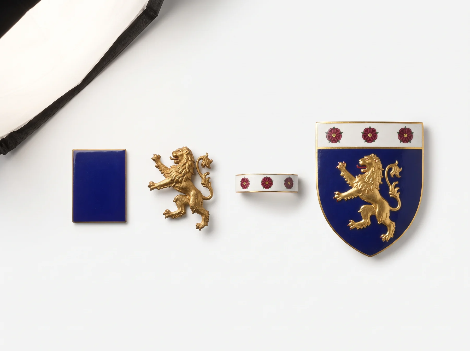
The Design Decisions an Artist Actually Makes
Shield shape
It carries period and place more than any other single choice. The early medieval heater shield is tall and tapering; Italian heraldry favours the rounded a testa di cavallo horse-head form; German arms often use a notched tartsche with a lance-rest cut into the dexter edge; Iberian shields tend to be square with a rounded base; the French écu is squared with small lower points. None of these is specified by the blazon, and each immediately signals a tradition.
Proportion and fill
The single commonest fault in amateur heraldic art is charges drawn too small. A charge should fill its space generously — a lion should reach very nearly to the edges of the field it occupies. Timid, floating charges are what make a modern reconstruction look wrong even when every element is technically present.
The drawing of beasts
A heraldic lion is not a zoological lion. It is a conventional animal with exaggerated claws, a defined mane and an articulated tail, and its job is to be identifiable in silhouette. The nineteenth century's naturalistic beasts are generally considered the tradition's low point precisely because they lose that silhouette.
Mantling and composition
The mantling frames the shield. Drawn well, it fills the awkward space between helmet and shield and carries the eye down to the charges; drawn badly, it becomes an explosion of foliage that competes with the arms it is supposed to set off.
Hatching: Colour Without Colour
A problem the craft had to solve. Engraving is monochrome, and from the sixteenth century most heraldry was reproduced in print — so how do you record tinctures in black and white?
The answer, systematised by the Jesuit Silvester Petra Sancta in the seventeenth century and standard ever since, is hatching: a code of lines and dots.
- Or — a field of dots.
- Argent — left plain.
- Gules — vertical lines.
- Azure — horizontal lines.
- Sable — vertical and horizontal crossed.
- Vert — diagonal lines from dexter chief to sinister base.
- Purpure — diagonal lines the other way.
This is worth knowing for a practical reason: it means an old black-and-white engraving of a coat of arms usually still carries its colours, if you know how to read the shading. A great many arms survive only in that form.
Styles Through Eight Centuries
- Medieval (12th–14th c.) — bold, flat and nearly geometric. Very few charges per shield. This is the period heraldic artists still consider the high-water mark, and most modern revival work looks back to it.
- Renaissance (15th–16th c.) — more modelling, elaborate crests, Italian and Flemish influence. Quartering begins to multiply.
- Baroque (17th–18th c.) — mantling becomes acanthus scrollwork, supporters become theatrical, and shields fill with quarters.
- Victorian (19th c.) — steel-engraved, minutely detailed, and naturalistic to the point of losing legibility. Enormous volumes of surviving heraldic imagery date from here, which is why so much "family crest" artwork looks Victorian: it usually is.
- Modern revival (20th c.–present) — a deliberate return to medieval boldness, driven by artists such as Graham Johnston, who drew for Fox-Davies, and later by the great twentieth-century heraldic draughtsmen. Contemporary grants from the College of Arms and the Canadian Heraldic Authority are frequently very striking.
What Separates Good Heraldic Design From Bad
- It works in silhouette. Reduce it to black on white and it should still be identifiable. If it dissolves, it is illustration, not heraldry.
- It works small. The test is the signet ring and the wax impression, which is where arms were used daily for four hundred years.
- It is simple. The oldest and best arms have one or two charges. A shield with fifteen quarters is a genealogical document, not a design.
- It respects the tincture rule — or breaks it once, conspicuously, for a reason.
- It fills its field. Generously drawn charges; no timid floating.
Fox-Davies put it bluntly in 1909: heraldic art is decorative art under discipline, and the discipline is what makes it good. An artist free to do anything produces a picture. An artist working to a blazon produces heraldry.
Where the Designs in Our Volumes Come From
Worth being exact, since this article is about how the work is done.
The crest in a Heritage Volume is original artwork generated by our system, built on the heraldic visual grammar described above and tied deterministically to the surname — the same name always produces the same crest. It is not a facsimile of a specific armorial entry, and it is not a grant of arms. How Your Report Is Made sets out, line by line, which parts of a volume come from public records and which our system builds.
If what you want is a documented historical blazon, our guide to verifying a coat of arms lists the armorials and registers to search, most of which are free and digitised.
See the design at full size in a framed coat of arms, or put it through the test that matters — a signet ring.


